Rebranding a Functional Medicine Practice
Client Nova Wellness

Services Branding, Website Design, Comms, Marketing Strategy, Email Marketing, Events, Campaigns
Challenge
Nova Wellness, a thriving functional medicine practice, was ready to step into its next phase of growth. With a loyal client base and a proven model, the team was looking to attract more patients, expand provider capacity, and lay the foundation for future wellness centers that could serve as community hubs for health-minded individuals.
The challenge was to evolve the brand without losing the trust and familiarity already built. The medical field often feels clinical, sterile, and overwhelming, especially for clients who arrive at Nova after years of being dismissed or overlooked by conventional healthcare. These clients come seeking answers, compassion, and a more personalized path to healing.
Our task was twofold: first, to deeply understand the pain points and emotional needs of Nova’s clients; and second, to create a brand and digital presence that reflected the practice’s unique promise: medical care that is both professional and profoundly nurturing. The brand needed to signal credibility in the medical space while also evoking elegance, warmth, and possibility.
Ultimately, the challenge was to show that healing doesn’t have to feel like an uphill battle. With the right care, it can be an empowering, even pleasurable experience.
Solution
We guided Nova Wellness through a comprehensive branding process that distilled the practice’s essence into core brand values including: the role of nature in healing, the body’s innate capacity to restore itself, and the belief that true health leads to vitality and pleasure in daily life.
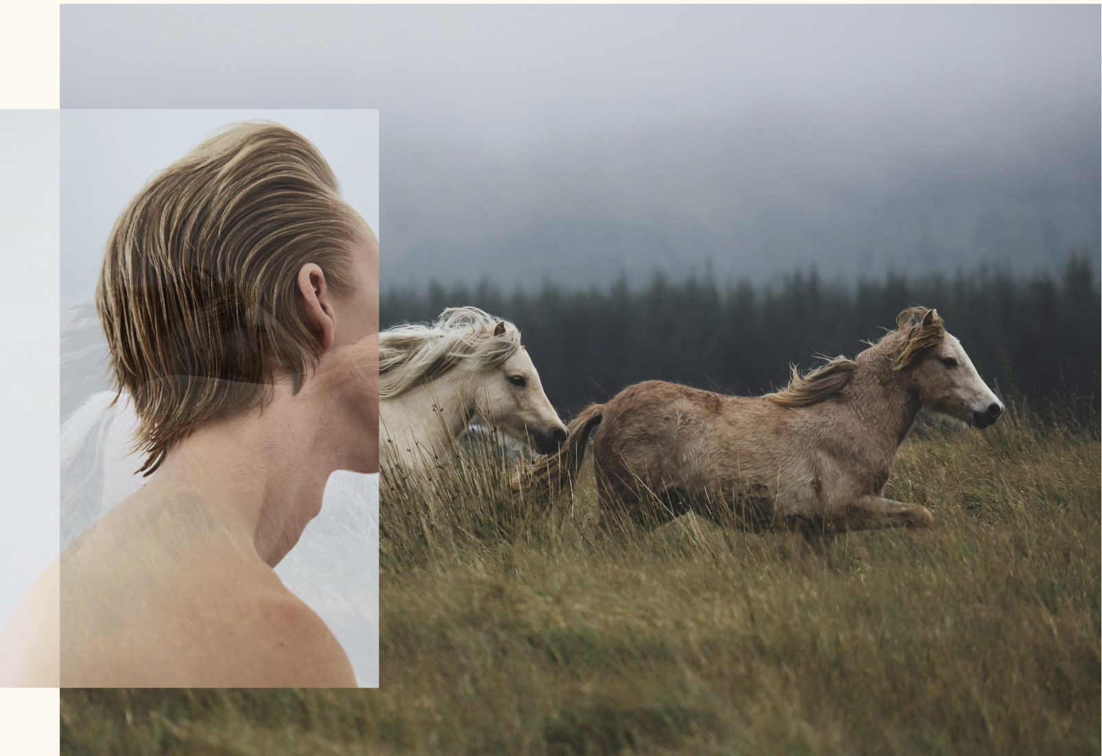
Drawing inspiration from the California Bay Area, where Nova Wellness is based, we developed a color palette rooted in the natural environment. The visual language evokes wide-open landscapes, abundant gardens, and the simple joys of life: the lushness of ripe fruit, the expansiveness of the outdoors, and the beauty of nature.
At the heart of the new identity is a mark symbolizing balance, growth, and grounded elegance. Influenced by sacred geometry, natural polarity, and organic forms, the mark is open to interpretation, allowing each client to see their own path reflected in it.
To balance warmth with professionalism, we paired the symbol with a modern serif wordmark. We chose Canela for its soft yet sophisticated character, embodying Nova’s unique blend of science and intuition.
Together, these elements create a brand world that is elegant, inviting, and evocative, one that clients can immediately “feel” themselves belonging to as they imagine their own journey of healing.
Results
The new Nova Wellness brand and website launched in July of 2025 to incredible feedback from clients and colleagues. In the first month of the new site being live, we saw an 81% increase in new users to the site, 36% increase in actions taken by these users and a 22% decrease in bounce rate. To date, we are reporting an average bounce rate of 4% (with industry standard being closer to 55%) and an average session time around 2 minutes, demonstrating that the brand, language and ad copy are resonating with our desired audience.
Web Design
Gallery