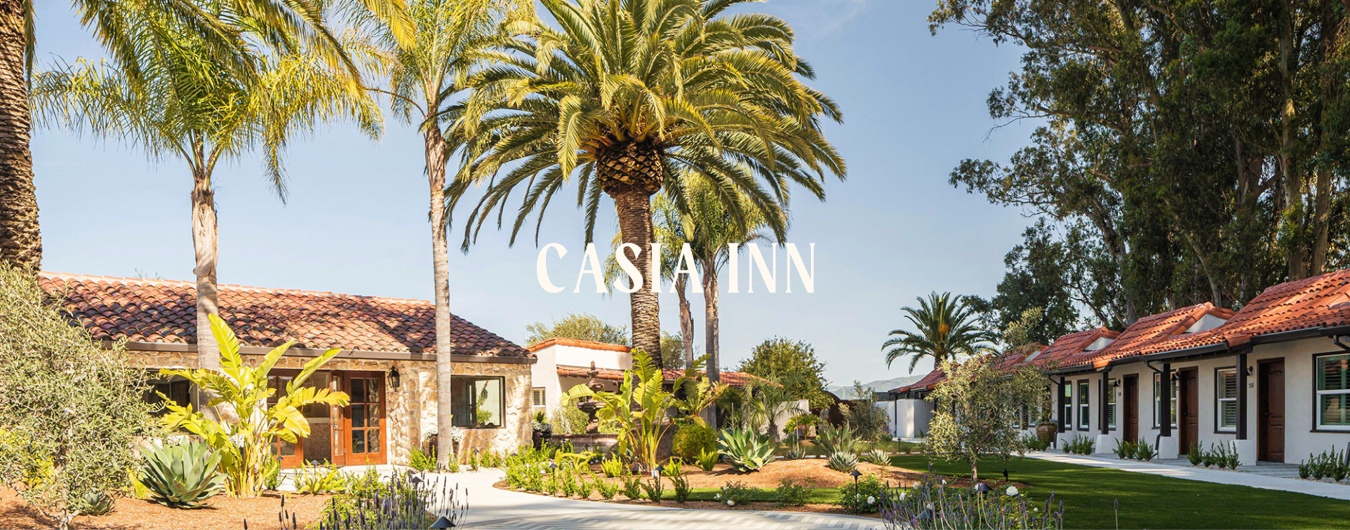
Rebranding a Hotel in
Sonoma Wine Country
Casia Inn - Hotel
Sonoma
Creative Direction | Website Design | Communications | Collateral | Photography Direction
Branding
A wine country hotel hiding in plain sight.
The new owners took over a location everyone drove past on the way to Napa - we built them a brand worth pulling over for.
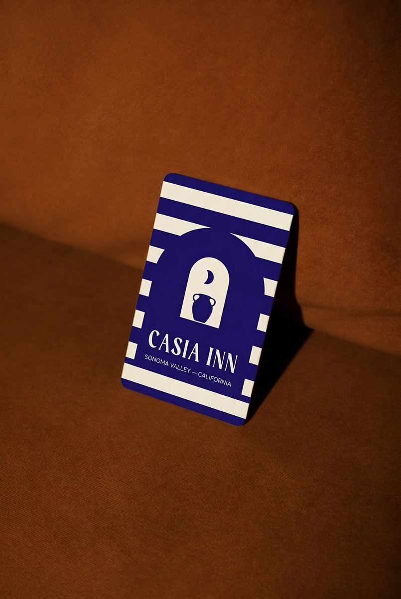
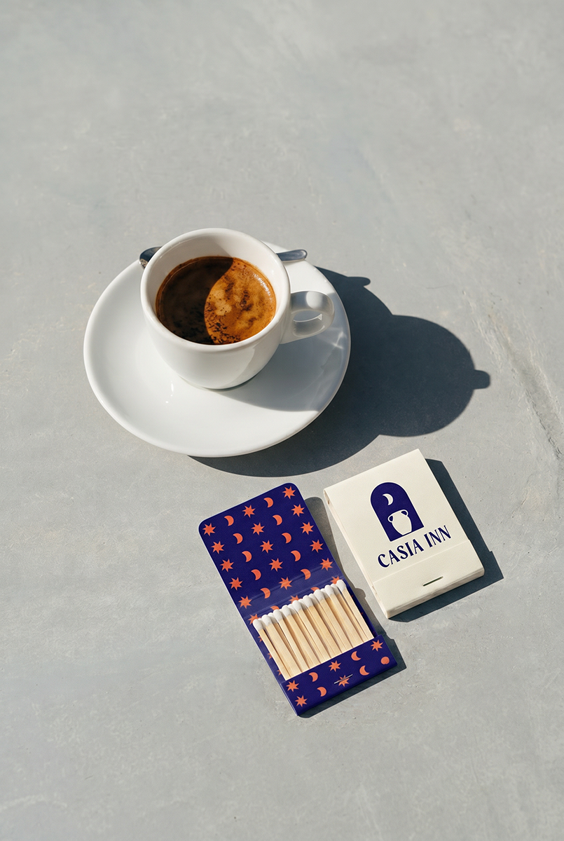
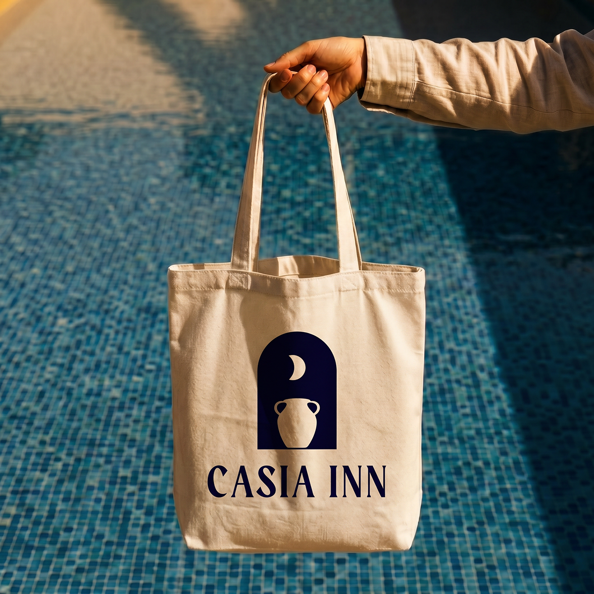
We landed on a brand direction that was California ease threaded through Spanish arches and Moroccan tile, without reading like a mood board collision.
In a region drowning in safe beiges and expected terracottas, we went deep violet and citrus. For a nod of fun and whimsy, we designed five unique brand patterns plus an owl mascot that appears throughout the property - because every great hotel needs a resident character who doesn't require a salary.
Five-star reviews out of the gate,
A GM who took the job because of the brand book
And the only Flamingo Estate partnership in Sonoma Valley.
100
100%
5
buy-outs before the one-year mark
weekend occupancy
in under 12 months
5-star reviews in
9 months